You are running your ad campaigns, and your Facebook or Google ads are working suitably. From everywhere you are undoubtedly getting enough backed traffic, but all other numbers are not increasing at all in sales growth or email list growth etc. All is due to not having a landing page, or you have a landing page notwithstanding not a great strategy to create it.
Everyone wants people to visit their page to take some action so that they can achieve the landing page goals.
On landing pages, taking expected actions from the various visitors is the conversion, and the conversion rate is how many visitors perform the expected action.
The average landing page conversion rate is 2.35 per cent.
What is a landing page and how important is it?
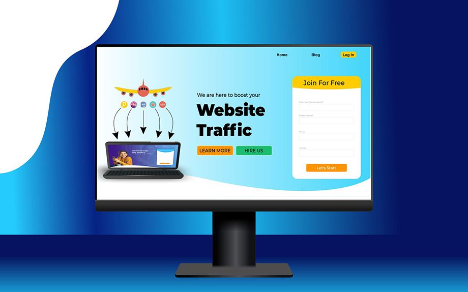
Landing pages are standalone pages on your site created for getting specific traffic from a variety of marketing campaigns.
The pages work in the same way as the airport for a flight.
The airport is where the aeroplane lands and the landing page where Internet traffic lands.
There are various ways to generate internet traffic on the landing pages. Different types of business use specific marketing campaigns according. They use paid ads, social media promotion, email campaigns, public relations, etc.
So, a landing page is where the paid ad campaigns clear the way of internet traffic. Consequently, running paid campaigns on a site increases the traffic dramatically.
Moreover, a web page is used to land the paid traffic. This page is known as Landing Page.
If your landing page is well created, then you will get the affection and trust of the visitors, in return, you can fulfil your goals for the landing page.
So, you have always been observant about the landing page, because the first impression for your specific visitors is the landing page.

Difference between Landing Page & Home Page
A homepage is the main page of your website and used to display all the information about your business. A landing page is for a specific purpose on the website and used for the paid ad campaign traffic.
On the homepage, your visitors get all the information related to your business. So a homepage has many links, pictures, or can be a video etc. It can be loaded fully, used as a display page for the entire business, while the landing page does not have many links. It has a clean design and proper formatting to make it easy for visitors to take action. The Clear instructions do not confuse visitors and reach straight for a specific purpose. That’s why a landing page needs straightforward C2A instructions.

Uses of Landing Pages
After reading so much about a landing page, you must have created an image for the landing page in your mind that beautifully designed web pages to entice visitors are landing pages.
No, the use of landing pages is not limited to attracting visitors. Everything is changing. The behaviour and usability of landing pages are also changing.
A landing page should be perfect to make your website visitors your followers.
And all this is possible through a well-planned landing page.
Uses of landing pages –
1. Value of money spent on paid advertisements –
Yes, if you are paying huge money on advertisements, but you do not have a landing page to land traffic. You are wasting most of the money, as only the landing page has the most ability to convert traffic.
2. Growing the Email list –
Yes, most of the brands use their landing page to grow their email list, because they know that the large email list is the soul of their business, and the landing page can grow their email list.
3. Can make brand awareness –
The Landing pages get traffic from different sources, and they converse directly with the visitors. So, if the visitors are getting engaged with your brand, it is increasing awareness and make it easy to establish as a brand.

The 4 Most Important Elements of a Landing Page
An effective strategy is definitely necessary to create a landing page so that you can successfully make your anonymous visitors your followers and serve the purpose of your landing page.
So the four essential elements for landing page success are discussed here.
1. Beneficial Title
2. Clear Instructions
3. Effective Visuals
4. Clean Designs
1. BENEFICIAL TITLE

“Title”
Anyone reads the title before reading the article because a 20-word title has the ability to describe an article of 2000 words.
So isn’t title the most efficient factor?
The first impression of the digital world is a title. Before clicking, people want to know what they are clicking. And an effective title can make their interest in your campaign.
This is why making the title more effective should be of paramount importance to you so that you can describe your strong image at first glance.
A catchy title can increase the conversion rate by up to 40 per cent.
The following techniques can be used to make the title beneficial and increase the conversion rate.
Problem Solver:
Problems are everywhere, and the Internet world is only there to solve problems.
Every website on the Internet is meant to solve some problem.
Can be related to health, business, job, studies or marriage.
So, visitors always come to the webpage only with problems. And the problem-solving title can convince the visitors.
You have to write the title, what problem can you solve. It will help improve your conversion rate. These types of titles are more effective.
Understand Your Audience:
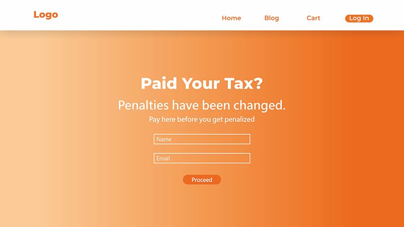
Assuming the use of your website is mainly associated with tax filing, then all your visitors will be related to finance.
You have to understand your audience, keeping the geography, language etc. in mind and write the title according to the maximum visitor.
So, write the title of what your audience actually wants. If you know your audience well, almost all problems are solved here. And you will win their trust.
Don’t use the confusing title:
Don’t use the confusing title:
You should not write a complicated title. It will reduce the conversion rate. Write the title in such a way that it is easy for the visitor to understand your intentions so that he can give the right response from his side.
2. CLEAR INSTRUCTIONS
The main goal of the landing page is to achieve the business objective.
Visitors to your landing page are already interested in you, only then they have come to your site by clicking on an advertisement or email.
Although your visitors have shown interest in coming to your landing page, if there are no clear instructions, they may be less interested.
So you do not need to show your creativity on landing pages, Build it with clean design and clear instructions.
So how to create a landing page with clear instructions.
It should be clear in the first headline for the visitor that what he is going to get on this landing page i.e. what is the purpose of this landing page.
In your Subheadings should be the ability to make the visitor stay on your page. If a visitor is as a guest and stopped at your first heading, then the subheading will serve them to stay at your page.
A subheading is the most vital part after writing the first heading. Hence, write proper and more detailed subheadings.
A call to action button. While the visitor is already familiar and follows your instruction till now, then this is the perfect time to create a lead.
Create a decent call-to-action button. It should be in an easily viewable point.
The call-to-action button can vary to the purpose of your niche and landing page.
Just as the purpose of your landing page is to get a visitor’s email, there should be a box for writing the email with a submit button.
If the purpose of the landing page is to sell a product, then the product description and purchase option should be there.
Remember, always simplify the call-to-action button as much as possible. The easy submission form has a high conversion rate. It will make it easy for your traffic to convert your customer or follower.
3. EFFECTIVE VISUALS
If you are going for an interview and want to dress up, what would you choose?
You will choose a much more formal dress instead of a flower print shirt and coloured pants.
Creating visuals on a landing page is similar to being prepared for an interview.
The visuals of the landing page should be more related to your niche. But keep in mind, always make easy designs for a landing page whether whatever your niche is.
The right visuals for landing pages are really effective to maintain conversion rate.
How to make a perfect visual for your landing page?
1. Layout
Layouts are the way things are organized on your website. It is a pattern to makes up the structure of a website.
Proper uses of layouts increase attraction that increases the conversion rates.
It plays a vital role in a landing page design. If the layout is not in the correct proportions, then the visitor may lose interest within seconds of visiting your site.
Try these top 3 most effective layout patterns to make your landing page engaging.
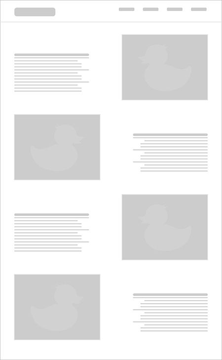
A. The Zig-Zag Pattern –

Zig-Zag layout makes content more eye-catchy and is more popular nowadays.
In the zig-zag layout pattern, images and texts are arranged in a way that the eyes move from left to right.
Zigzag patterns are efficient when there are more images. In this, you can place images from right to left.
This layout is more attractive than simple layouts that have one line under each. It breaks the monotony and increases interest on long pages. In this layout pattern, it is impossible to ignore images in any way. So, it can be an effective layout pattern for your landing page.
B. Full-Screen Image –

Full-screen image layout is now the most common and familiar pattern. Web designers love this pattern, and most websites are using this pattern.
Use the full-screen image with supporting text or title. It is an ideal layout for a website to have direct engagement with visitors.
Some points that will help you in using this layout pattern-
1.Make it subject-related.
2. Use a high-resolution image, quality matters.
3. Images should correspond.
4. Choose the one that reinforces your brand.
5. Use humans if possible.
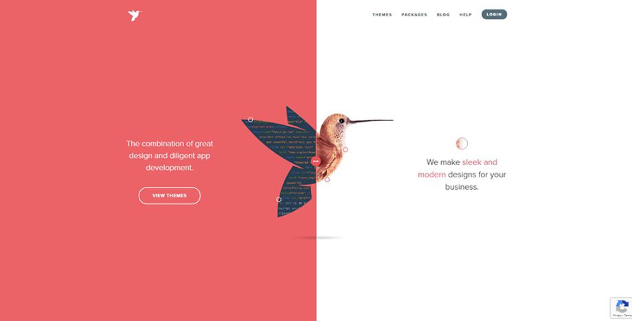
C. Split-screen layout –

The split-screen layout is a breakdown of the traditional pattern. It breaks the screen horizontally and values both parts of the screen.
However, the split-screen layout is suitable for low-detail landing pages.
If you want to display two different details simultaneously. This layout pattern can be useful. For example, if you want to differentiate your product description, and separate praise from skilled employees, you can do so by splitting the screen.
2. Pictures –
Pictures are the bold element of any visual design. Without images, visuals are not complete.
So, in your landing page design, you should not ignore images to add to your landing page visuals.
Properly added images are useful in building trust, making sales, generating leads, getting attention, making design attractive, and many more
Few tips to adding images in the landing page :
1. Don’t go with random stock photos:
This is the most common mistake most people do with their website by adding random images from any stock photo site.
Yes, well-captured stock images by professional photographers are efficient, but they are more common in search engines. So nowadays people have stopped giving attention to the stock photos.
So, use images that you’re own captured, they work well whether you’re not a professional photographer.
2. Image out of topic:
Assume you’re trying to generate your email list and you added an image of a random sports car, it will not work to build trust and people will decrease their interest in subscribing.
So, use an image that converses with your visitors.
3. Use an image that coincides your subject:
A well-designed and colourful landing page need an image that matches the theme.
If your image is captured well and matches exactly with your landing page colour theme, they will look spectacular.
But if your image does not match with the colour theme, they will be noticeable and look scary.
3. Colours –
Colour is another most useful element in landing page design.
Colour directly influences the human mind, so smart colour designs can very well prevent any bounce-back visitor.
Here, colours are not to play with designs. Every colour influences the mind in different ways. So, always try to fill colours that match with your niche and make a sale of your product. Or choose the colour that conveniences your visitor giving their email to your lead generation campaign.
Everyone knows that colour has a direct influence on psychology, but very few people know how and which colour affects the different moods of people.
How to choose colour combinations:
If your landing page is working to sell the product, then you need to know the mood of your visitors.
First of all, they should feel trustworthy on your site, so that they can pay for the products.
Second, you are showing your product details on the landing page. Here you need confidence.
Third, on a product sales page, people buy products. A desire to buy products is required here.
Now, find the best combination for colour that meets all needs and looks better with each other.
Here, you can use blue for trust.
You can use blue or yellow for confidence.
And for desire, you can use yellow again. Therefore, here you got the two-colour combination, blue and yellow, now create an excellent landing page with this combination.
Red :
Red is the first primary colour even in modern or ancient primary colours. The colour symbolizes adventure and describes courage, confidence, and desire.
Red is widely used for branding in a landing page design.
Red colour reflects the energy, passion, and love, so for the call to action landing page designs red is the first choice.
KitKat is a popular website that uses red as its primary colour.
Orange:
orange is the colour of happiness. On a landing page, the orange colour can attract visitors with the calmness from the yellow side and energy from the red side.
Small advice is, you should definitely use orange if your visitors are young because the orange colour spreads the enthusiasm and the younger generation is attracted to orange colour the most.
The world-famous example of orange colour use on a website is Amazon.
Blue :
Blue is the most liked colour in the world. It represents intelligence and calming.
The blue colour is not a single colour, it has a lot of shades and they all have their own different attitude. The best combination of blue colour is a mature grey colour.
Blue colour describes trust, serenity, stability, inspiration and wisdom.
The world-famous brands they used the blue colour to build trust are -American Express, Visa, LinkedIn, General Motors, Facebook, Intel, Dell, HP, and many are there.
Green :
Green is a global natural colour mostly used for nature, growth, and wealth.
Green colour can make your landing page a natural look. If you’re related to the health niche, this is the perfect colour to represent your thoughts.
In the U.S., the dark green colour is a symbol of money and represents prosperity.
The successfully established website using green for its primary-colour is Envato.
Black :
Black is a bold and powerful and mysterious colour. Perfect to match with every colour, mostly used in typography.
The perfect example of the brands that represent themselves with the most dominant black colour is Dior, Apple, Disney and Nike.
There’s also a lot of other colours available that have their own stories, like the famous colour yellow, a bright and confident colour.
Pink is femininity, playfulness, and romantic colour. Purple is a luxury colour. Brown for warmth and honesty, represents the agriculture scenario and many more colours are available that need a separate post to describe them.
Take a Look to Real Examples
So even you have come to know that every element is necessary for a landing page. And you gained a little knowledge about each component. So, why not take a look at the famous landing pages that are doing well with their creativity in this competition era.
WebFlow is a tool for developers for design. And the most attractive thing is the clever title on their landing page. The title is attractive enough and the “Get Started Button” is a perfect example of a call-to-action button.
This is the other example of an ideal title, minimal design and a perfect image combination.
The Perfect C2A button “Try It Now”, to convert anonymous traffic.
And the “Learn More” button reduces bounce back.
Vimeo is a video maker tool. They use a bigger CREATE on their landing page, showing their dedication to making the video.
Also, they play a video on their large CREATE to explain the use of their tool. A good subtitle, and C2A button, that has a word “FREE” that alone is enough for lead creating.
LeadPage is a self-landing page builder. So, why not check their landing page which they are using on social media advertisements.
It is a clean and shiny design. Using the success story in the title is a smart thought to increase conversion rate.
The call-to-action button is used directly as a “Start Your Free Trial”. Also, hiding the menu items on the landing page makes them an expert.
Here you find the ideal title with an explanation video. So their methodology can be easily understood by visitors.
Excellently established a call-to-action button. Also, they used real-life reviews to increase trust in their brand.
Conclusion :
Landing pages are the soul of the marketing campaign. In this competition era, every business needs a landing page. Where you will always have to be one step ahead of your competitor, only then you can reserve your place for success.
Everything changes in this modern age and marketing methods are also changing over time. All you need is to find these new ways and learn how they work.
Landing pages are always useful but smart steps.
Your campaign will be successful more If you do it well.
